Templates
Six templates we'd use on our own projects
Picking your own favourites is a bit much. We did it anyway, and we said why.
Picking your own favourites is a bit much. We did it anyway, and we said why.
There are 152 templates in the library, and every one of them exists because one of us thought it should. Ranking them is a slightly ridiculous thing to do.
We did it anyway. Not best sellers — these are the six we'd reach for if a real brief landed on the desk tomorrow.
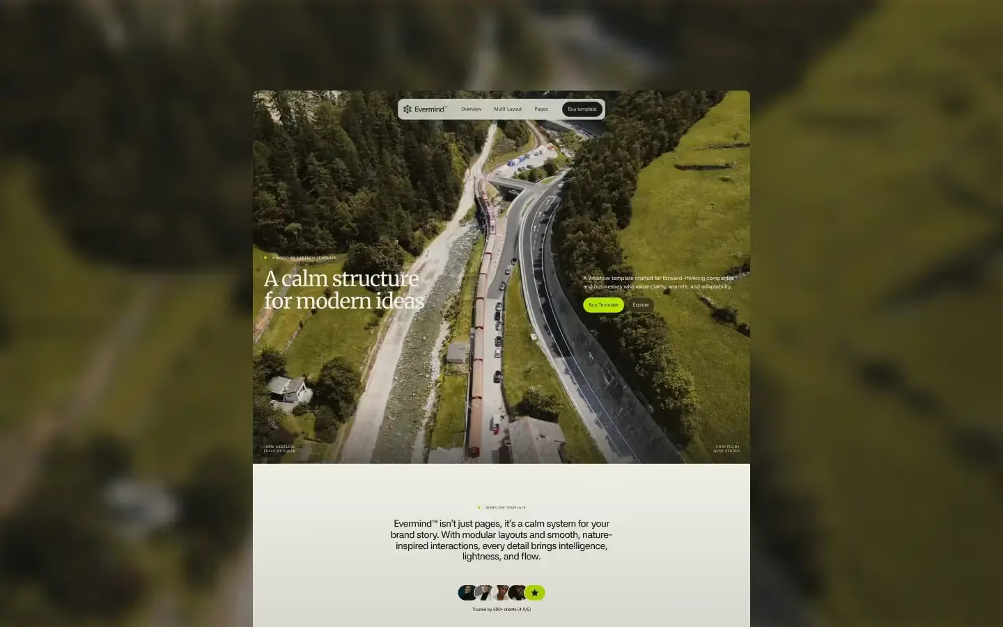
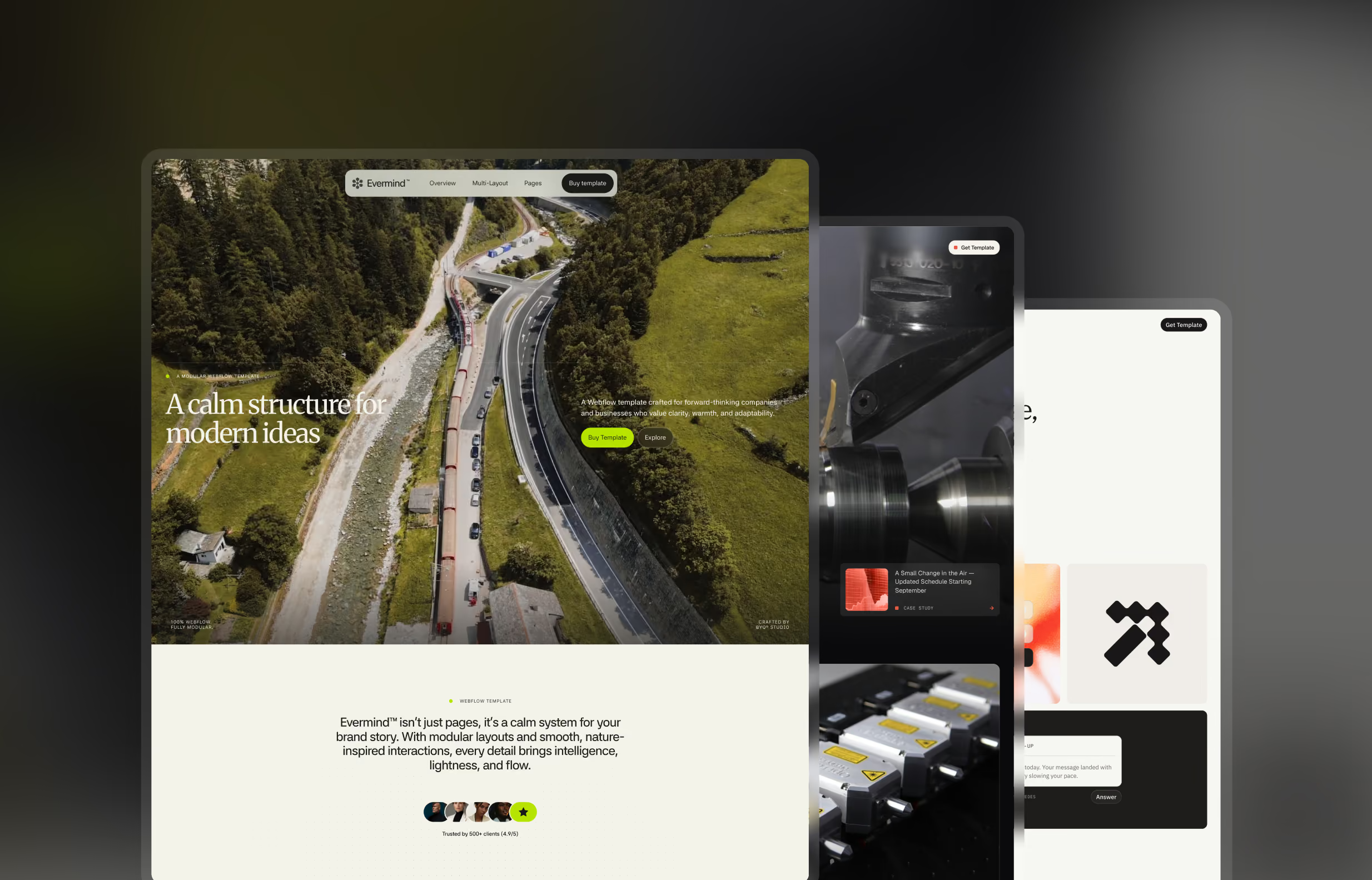
Evermind is for companies whose value is in what they believe, not what they ship. Studios, non-profits with a real budget, brands where the why does the selling.
That sounds soft until you try to build one. Those sites are full of long copy — a manifesto, a proper about page, three paragraphs where most sites have a headline. And most templates quietly fall apart the moment you give them three paragraphs. The type gets small, the measure gets wide, and suddenly the most important thing on the page looks like terms and conditions.
Evermind doesn't do that. The editorial blocks were built to make a wall of text feel deliberate, and that's a harder problem than it looks. It ended up at #2 on the Webflow Marketplace, which we don't think is a coincidence.
The first thing to change is the colour tokens. It's all on variables, so that's an afternoon.
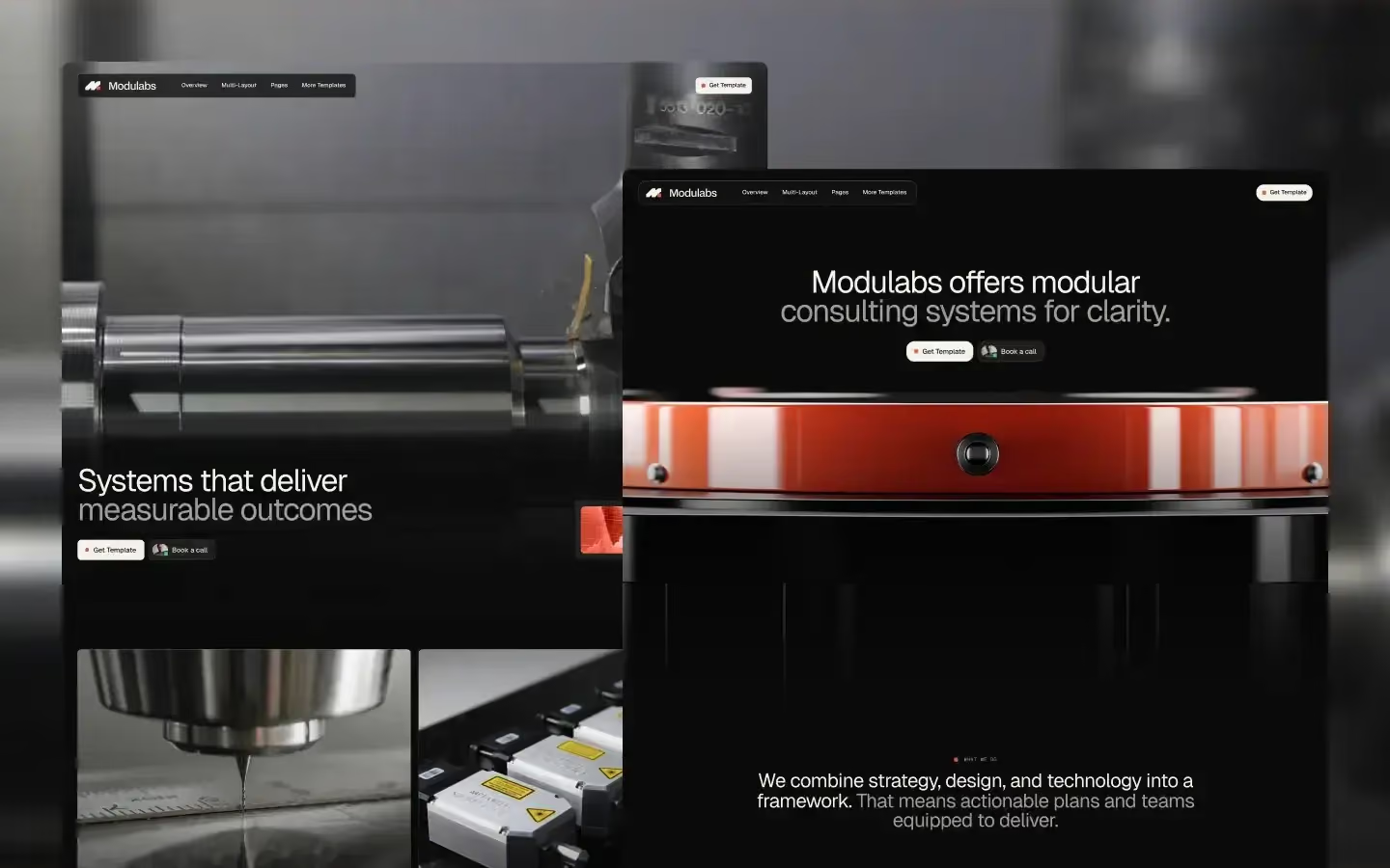
Modulabs went to #3, right behind Evermind, and it's the opposite kind of thing entirely.
Where Evermind is expressive, Modulabs is disciplined. Everything is a component, everything snaps to the system, nothing is a one-off. For technical companies — consultancies, R&D teams, engineering-led products — that restraint reads as competence in a way that a big animated hero never will.
The real test of a modular template is whether it survives being rearranged, and this one does. Genuinely modular, not modular in the marketing copy.
Our advice: don't change the structure. Swap the content and let the system work. Fighting Modulabs is a mistake we've watched people make.
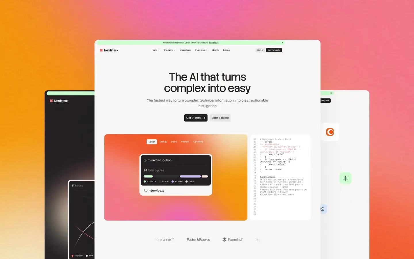
The hardest brief in web design right now is explaining something complicated without either dumbing it down or drowning the visitor. Every AI company and dev tool is stuck on it, and most of them end up with three feature cards and a screenshot, because that's all their template gave them.
Nerdstack gives you the layouts for actually explaining a system — diagrams, flows, before and after. Room to show how the thing works rather than just claiming that it does.
Which creates the opposite problem: there's more explanation surface here than most products need. Pick the two moments that genuinely require it and delete the rest. Restraint is the work with this one.
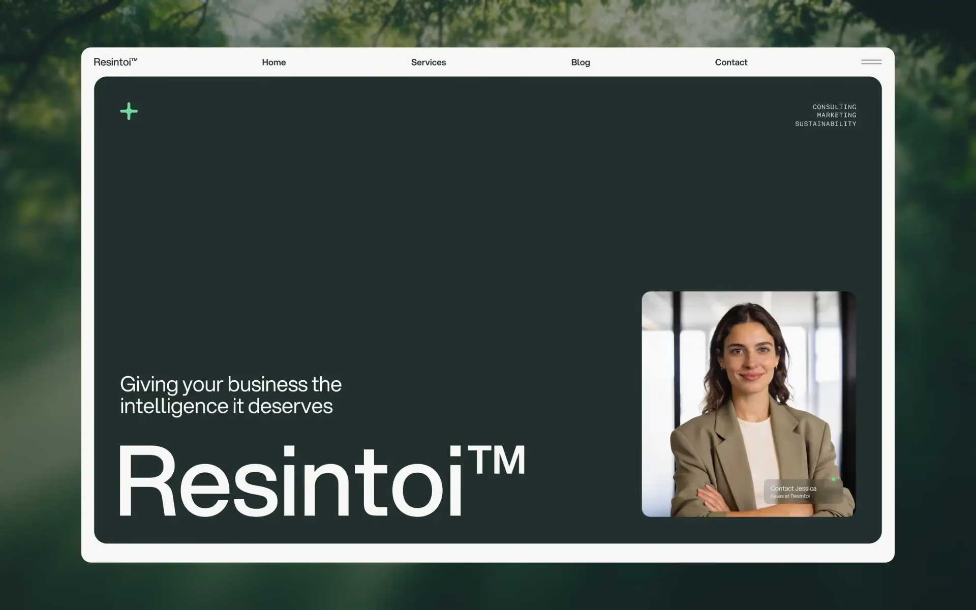
Sustainability is a brutal category to design for, because there are two obvious failure modes and both are fatal.
Go corporate and you look like greenwashing — stock photography of wind turbines, a green accent colour, no substance. Go handmade and you look unserious, which is a problem when you're asking a board to sign a contract.
Resintoi threads it. It's warm enough to feel like it means it and structured enough to feel like a business. Built for sustainability consultancies and coaches, and it holds up for adjacent impact work too.
If you only change one thing, make it the imagery. This is a template that rewards real photographs of real work and punishes anything that looks bought.
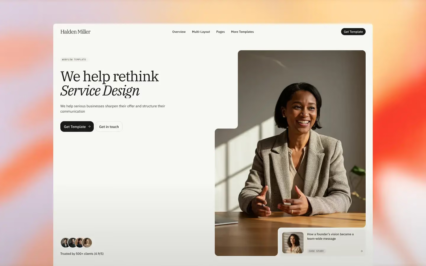
Consultant websites have their own specific failure mode: they end up looking either like a CV or like a SaaS product. Neither one says this person costs what they cost.
Halden Miller is the answer to that. Elegant without being precious, with room for credentials and case work that doesn't turn the page into a résumé. It's best when the consultant genuinely is the brand — a senior independent, a small advisory firm with a name on the door.
Fair warning: it lives or dies on photography. It's built to frame a good photo beautifully, and it will frame a bad one just as prominently.
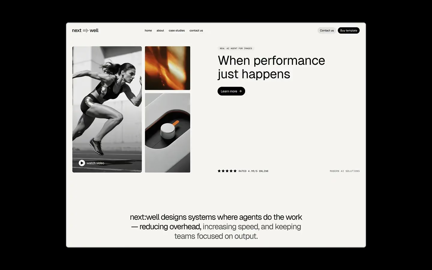
Nextwell is the one for when the brief is still moving.
Shared variables, real light and dark modes, Client-First structure underneath. It's less a template than a well-organised place to start — the right pick when you'll still be extending this site in two years, or when the client hasn't decided what they are yet.
The light/dark is done properly, which is rarer than it should be. Not a filter over the top — a real second theme, on tokens.
The trap is the flexibility. Nextwell will let you build anything, which means it won't stop you building something shapeless. Commit to a direction early and it's excellent.
Ignore the screenshots for a minute and ask three questions.
Does it have the sections your content needs? Not the sections that look nice — the ones you'll actually fill. If you've got six case studies and no team photos, a template built around team photos will fight you every single day.
Is it on variables? If yes, rebranding is an afternoon. If no, it's a week. This question is worth more than the other two put together.
Can you delete half of it and have it still work? Good templates degrade gracefully. Fragile ones collapse the moment you remove a section.
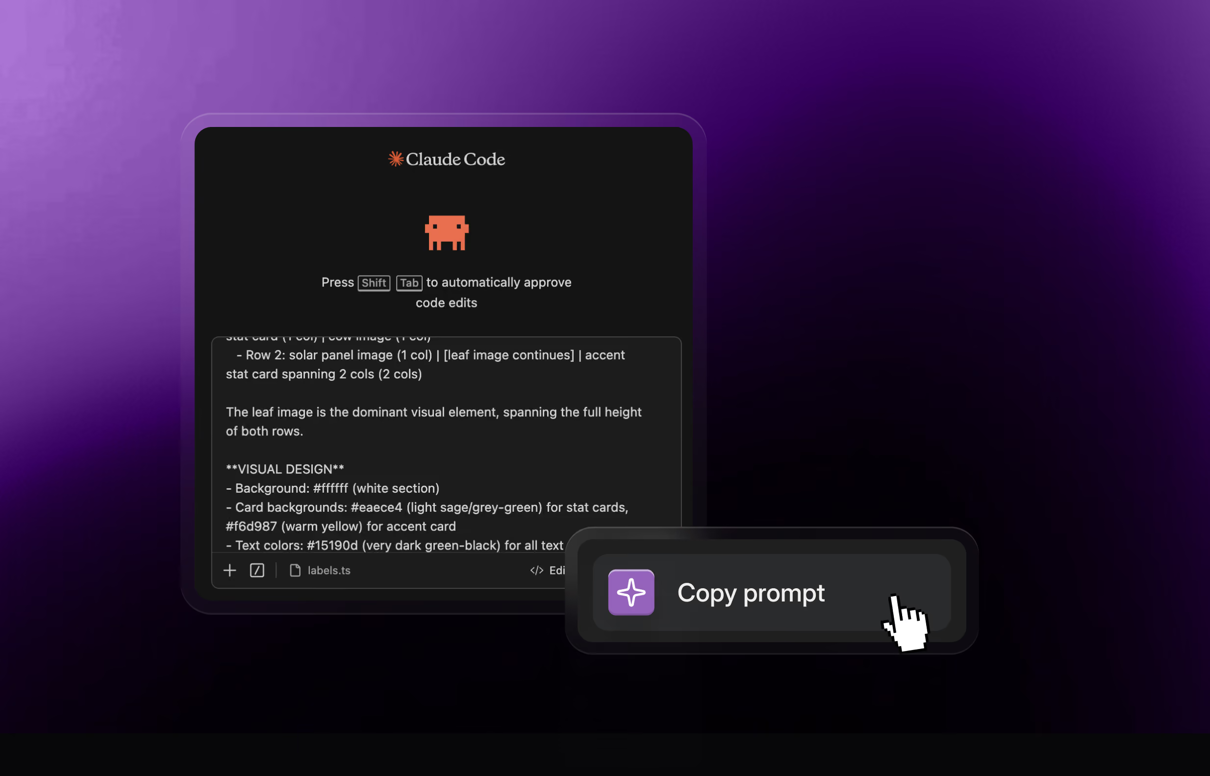
One more thing worth knowing: every template above ships with its design system. So you can hand it to Claude Code or Cursor as a styling foundation, and any extra section you generate comes out matching the template you started from.
Not sure which fits your project? The right template for the jo sorts them by what you're building.